There’s a very interesting arts contest going on right now at  http://www.citid.net/
They are asking graphic designers to create a logo for their city, that captures the vibe of that city. It’s for a future book and exhibition.
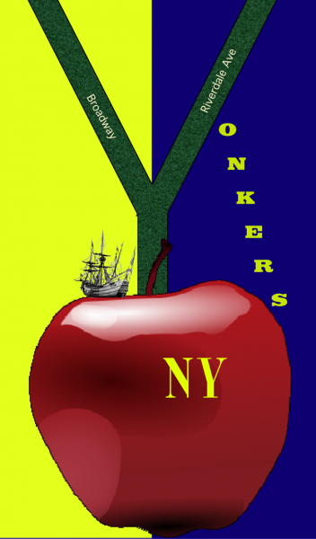
Not being a graphic designer, I decided to come up with one anyway. My idea is that Yonkers is at the top of the Big Apple, and leads into it. I then thought about the Half Moon, and decided to have the Half Moon land at the crux of Yonkers and the Big Apple (which it did back in 1609)
Here it is.

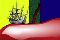
You also had to come up with a much smaller thumbnail, which I did.

I actually like the thumbnail better than the logo. I think it’s got more artistic promise than the logo I created. It’s less literal, and thus promises more. Nevertheless, I submitted the original. I might go back and create a larger version of the thumbnail, and submit that as the final piece instead (and perhaps with a third image in the blue)
I encourage all Yonkers artists to participate in this project. It would be fun to see what you all come up with!
Leave a Reply